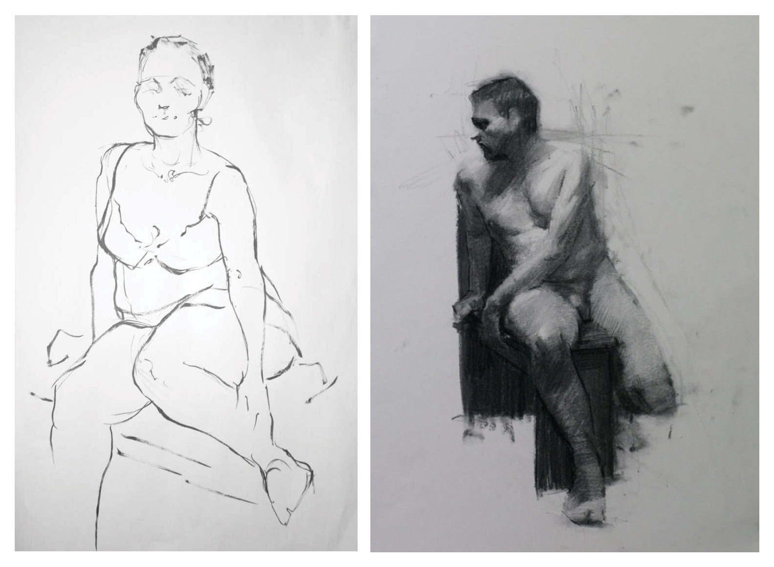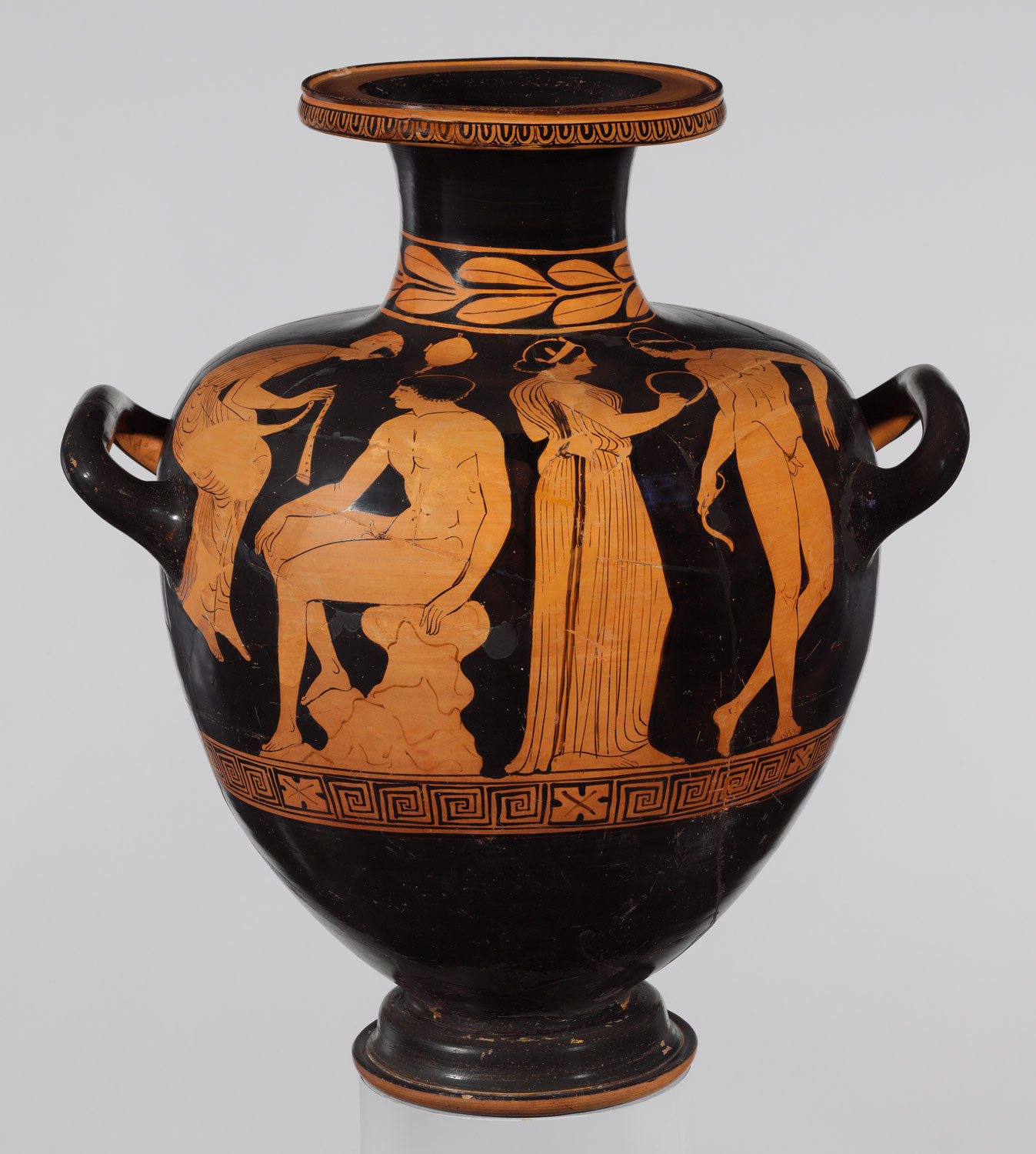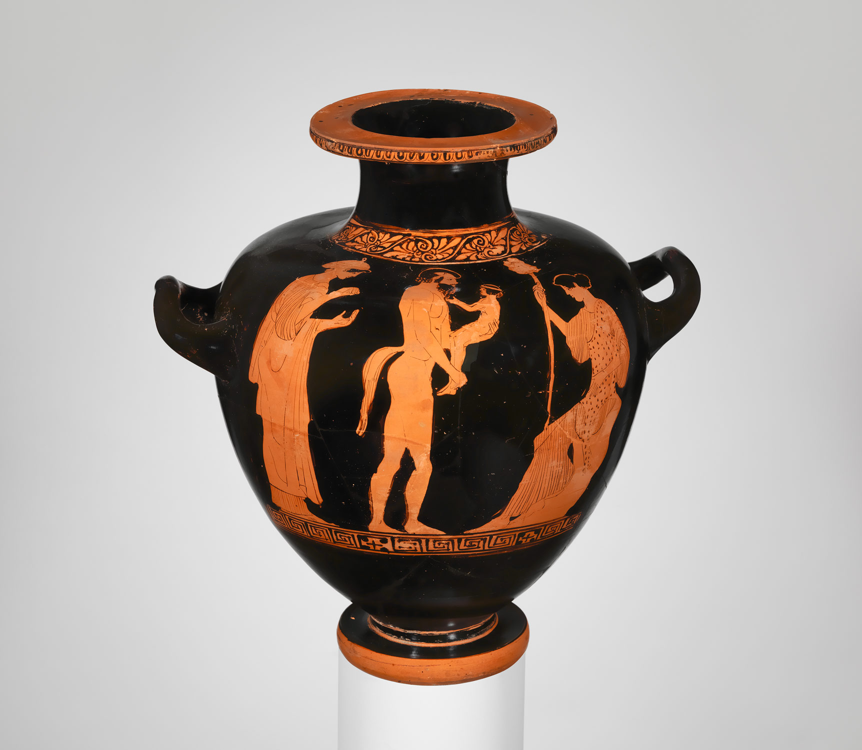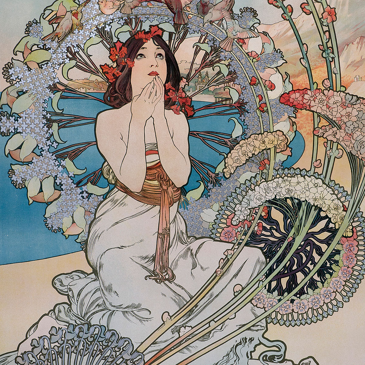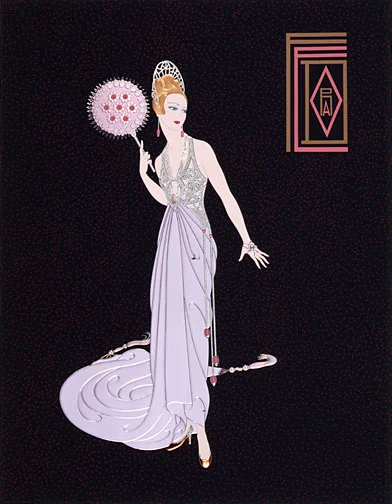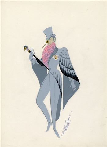
the hidden art of form-contour line
Form-contour line rendering has a long history of artistic use (as can be seen in the examples above showing classical figure studies). It is unfortunate that during its inception, this method of rendering was rarely seen by the contemporary general public. The technique evolved as a process used to study forms; these drawn studies would ultimately be used as elemental tools to assist the creation of painted masterworks. This advanced style of form-contour line rendering was not witnessed in ‘masterworks’ until the invention of lithographic printing.
Lithographs were first created as a cheaper means of producing literature; however, it didn’t take long for the process to evolve and become a tool for artists to produce and distribute artwork. Lithography involved carving lines into a plate which would hold ink. The image was transferred to paper by being sent through a machine that would press the ink onto the page. This groundbreaking method of reproduction demanded the application of complex line techniques. For the most part, lithographic lines borrowed from previously developed methods used in sketch studies. As a result, this wonderfully constructed rendering technique, previously a mere scaffolding, became the beautiful visage of the masterwork itself.
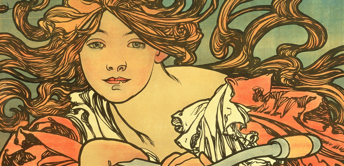
HOW LITHOGRAPHY EVOLVED LINE USE
Once lithographic printing took root, the art of rendering with line contour evolved to new heights. Examining the technical feats of these 18th-century lithographic prints is awe-inspiring. Artists created a full range of tones using line alone (although eventually techniques of lithography allowed for tonal washes using a chemical process). Standing at a distance, a lithographic image will produce a similar range in tones one would encounter within a photograph. This variation of tone is almost entirely obtained through the use of line contour.
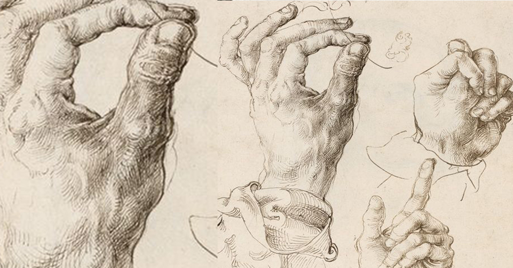
Form contour lines, being the primary foundation of lithographic prints, are lines that flow across the form. This technique creates the illusion of both tone and depth. Since the lines trace the forms, an additional layer of information is encoded into the image which gives the observer further clarity of the forms. There are several line contour techniques used to help create the illusion of shifting tones. One method is spacing the lines tighter together progressively as the form travels further from the light. When the form-contour lines are pulled closer together they produce a darker tone. Another technique is having lines rounding toward the light become thinner in their application. Inside the interior of the shadows, an artist would add the addition of cross-contour lines when necessary to add a bit more clarity to the forms as the forms become darker in tone.

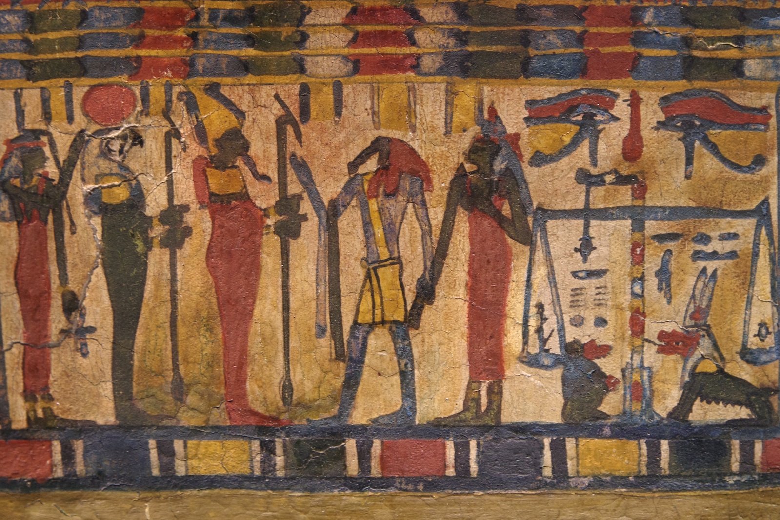
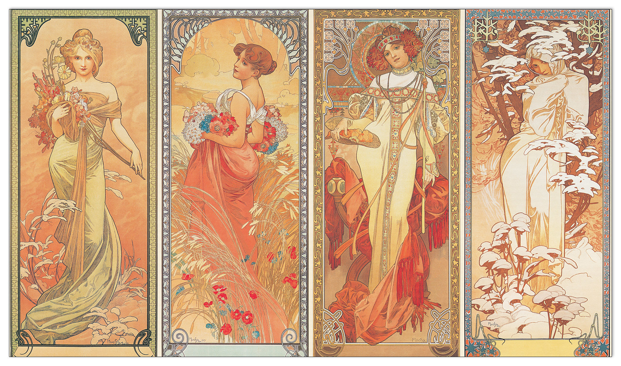
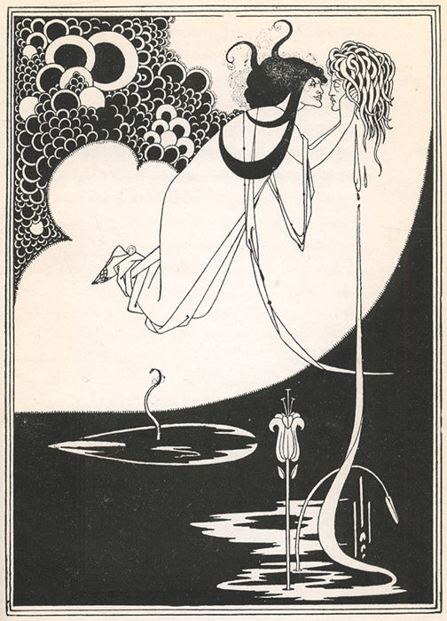
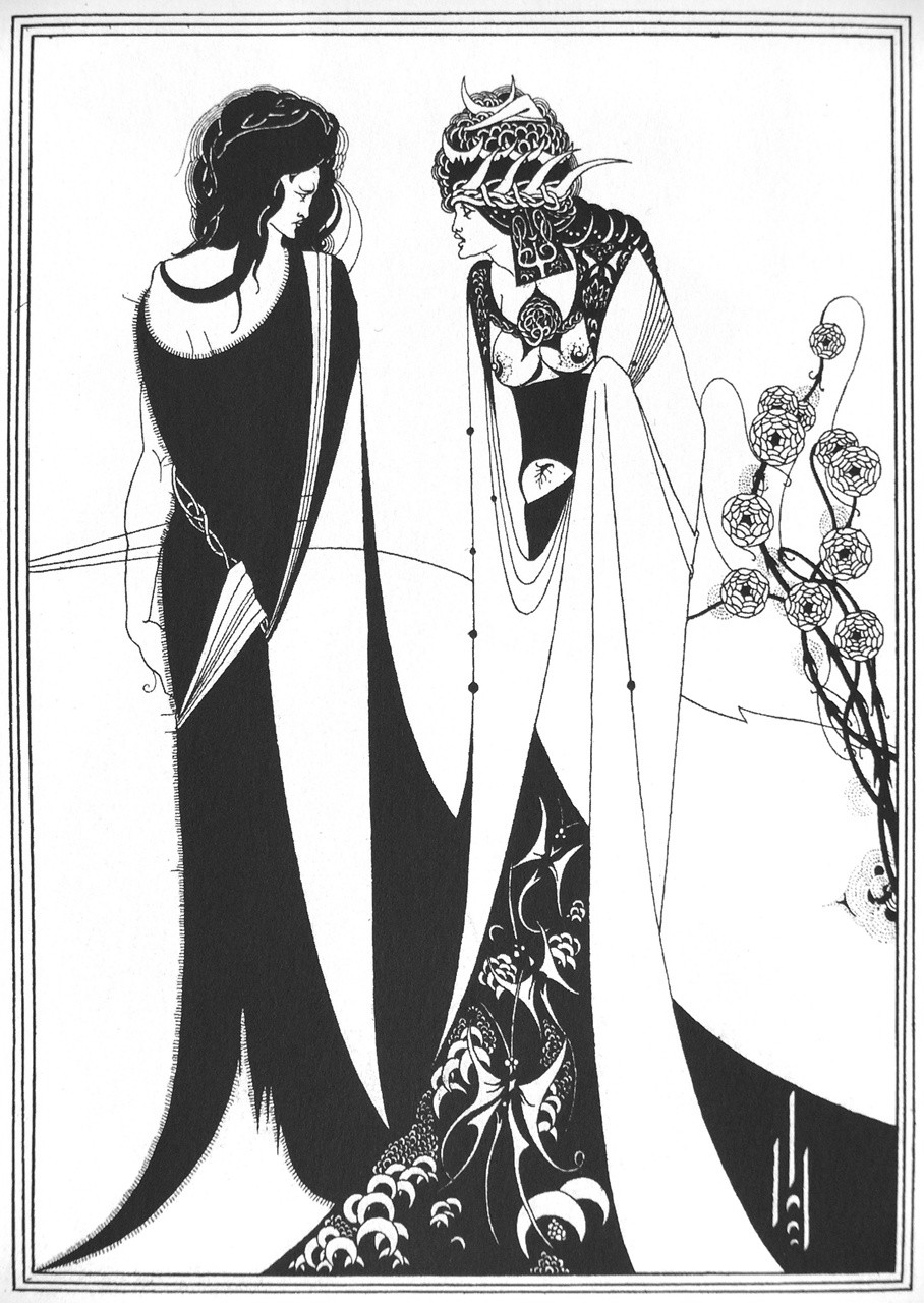
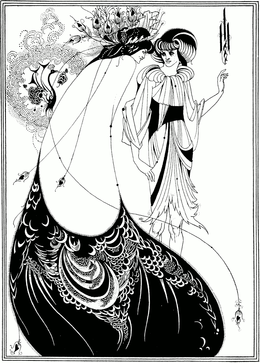
Albretch Dürer lithograph
The real beauty of these lithographic masterworks is that artistic display of the understanding of the form of an object. Paintings do this entirely through tone alone, allowing the reader to register the form with their own eye’s ability. With lithography, an artist is showing their ability to understand form and the lines act as an exhibition of the act of application. In some ways, this style of art was a precursor to the invention of a ‘painterly style’ in which the painter desires the viewer to see their strokes and thus act of creation (the artist's mental processes).
from lithograph to inking
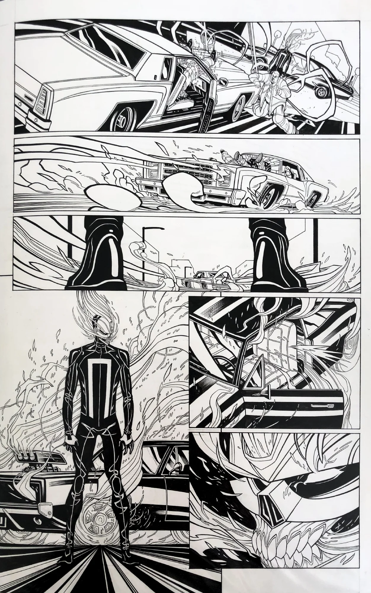
The real beauty of these lithographic masterworks is their technical display of the artist's comprehension of forms and dimension. Paintings display depth and dimension through tone alone, which allows the reader to register the form as an eye would observe light in nature. With lithography, the artist is able to show off their understanding of form through the act of line application. In some ways, this style of art was a precursor to the invention of a ‘painterly style’ in which the painter desires the viewer to see their strokes and thus witness the act of creation (the artist's mental processes).

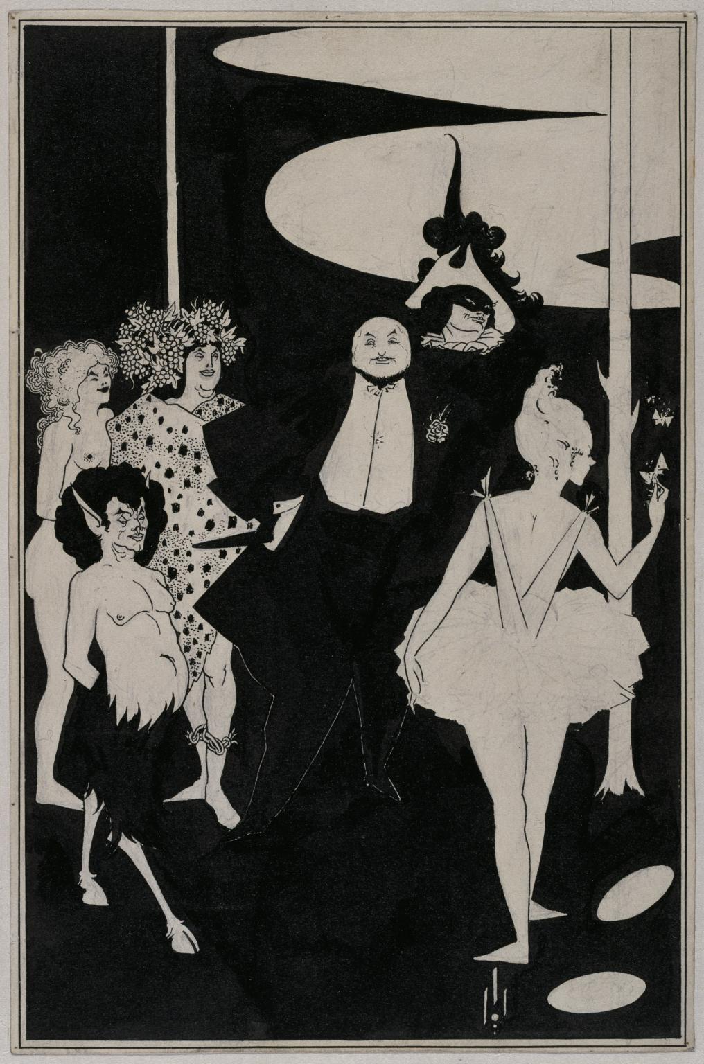
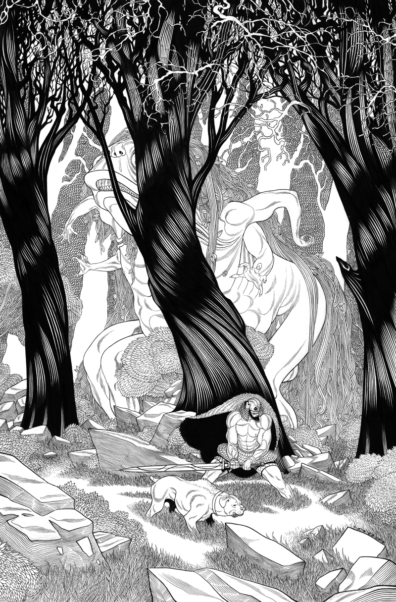
Bernie Wrightson Inked drawing
form-contour lines in comics
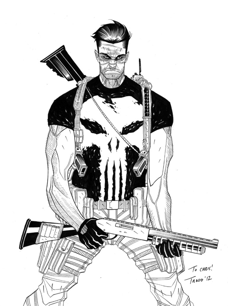
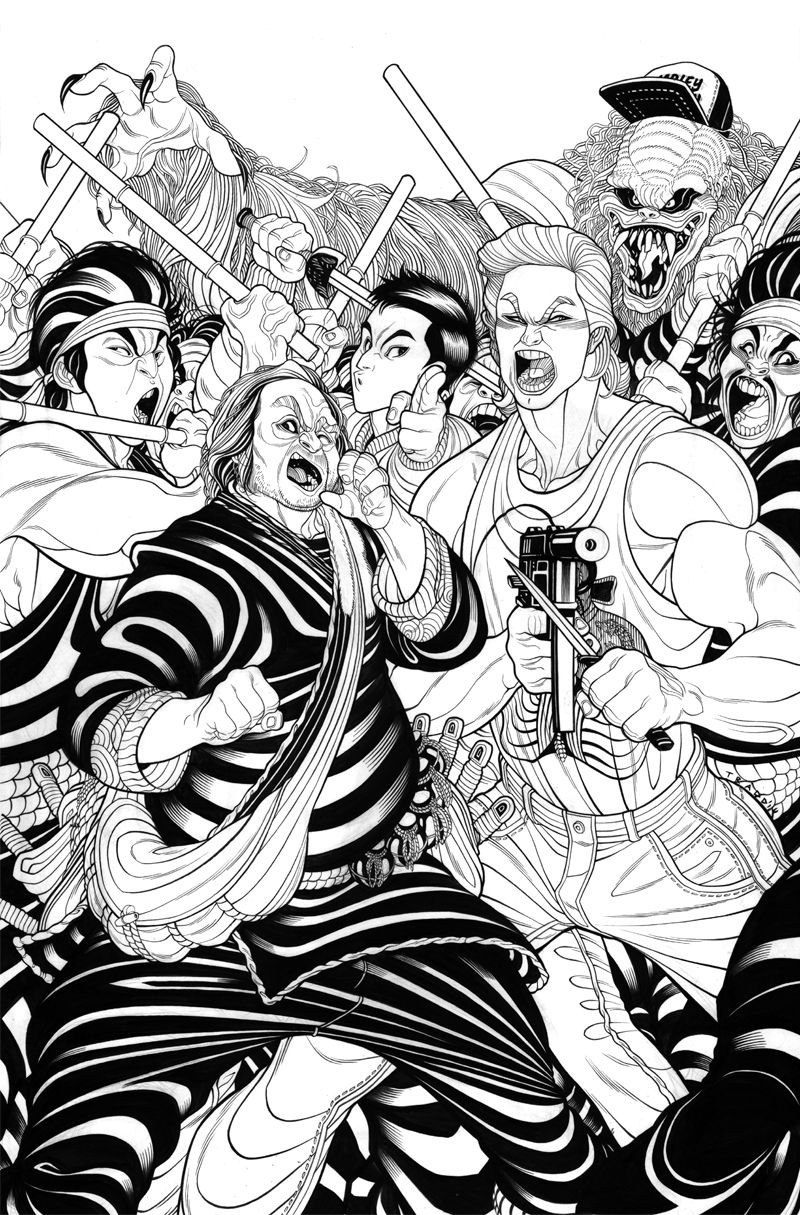
In the world of comics, form-contour lines are universally employed. Typically not to the degree one would find on a traditional lithograph. Most comic artists don’t use a heavy amount of form-contour lines to create the full range of tones to mimic photography, due to time constraints and deadlines. However, they still utilize the trick of having form-contour lines express the rounding of forms into the third dimension. Below is an example of some minimal use of form-contour lines to round the forms of the figure. This small bit of information conveys so much to the readers subconscious whether they are aware of the marks or not.

Arthor Adams Inked drawing
With comic line work, there is a balancing act between the line work and the coloring. Prior to digital coloring programs and improvements in printing, the coloring process was flat. Therefore it was the responsibility of the line work to render the forms through a heavier use of form-contour and hatching lines. Ultimately, with modern forms of digital-coloring, the tonal variations are created more efficiently on the computer. Thus, most modern comic art directors tend to hand pick cleaner line work and pair it with more lavish coloring. However, the best case scenario is a well-balanced use of form-contour lines in combination with the right balance of tonal coloring.
Line contour is a rich application of rendering form and as long as there is black and white illustration it will continue to evolve and grow for years to come.