The War on lines
Some moments stick in your mind like spoiled taffy, bitter-sweet. Sometime back in 2002, I woke up eager to attend my first academic life-drawing class. Strolling to class with my morning coffee I felt confident I was going to make an impression on my professor with drawing abilities. The model struck a pose and my pencil began christening the fresh art pad with a wonderfully rendered line drawing of the figure before me.
After finishing our first long pose we were instructed to post our finished pieces upon the class wall for examination and critique. The professor most likely wanted to see where our coordination - and more importantly our artistic mental abilities - currently stood. Scanning the wall, the professor finally approached my drawing and I awaited the adorning review. Instead, the instructor began a crushing critique that haunted me for the entire year. “Stop drawing lines. You need to stop thinking in lines.”
The advice was a double-edged sword. I had previously only studied comics, an art form with highly stylized and skillfully applied lines. My hope was I would learn more about the mental process behind the techniques I had been studying. My entire artistic foundation was yanked out from under me. For a while I was devastated, however, It did help me break my addiction to my constant use of line. As a result, I was forced to start thinking in three-dimensional forms. However, it left me in a state of confusion for a long while as well. I grew up on comic books which held the beauty of line as a powerfully graphical tool. Lines in comics are an expressive cornerstone to the original art form. Yet to further the art education I was asked to let them go.
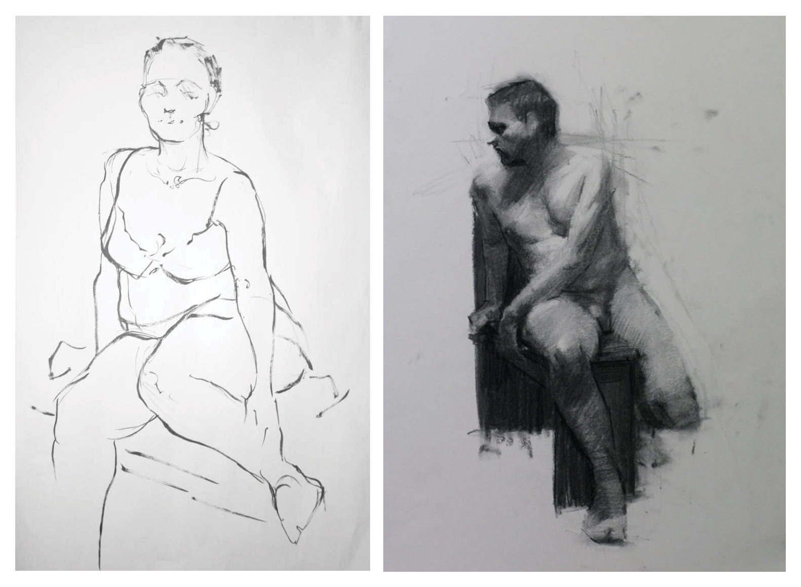
A comparison of figure line contour with the rendered form of a figure.
MAKING PEACE WITH LineS
What I have come to understand since then is that an art school worth its salt will first heavily focus on a classical chiaroscuro approach. This is designed to break a young artist’s tendency to draw two-dimensionally. When we first learn to both observe and draw we typically begin with the line. We notice the borders of an object and try to ‘outline’ it and then use lines for prominently overlapping forms. Alongside that, most developing artists copying other illustrations and photos. By copying the shapes and tonal variations the artist is tricked into thinking they have an understanding of three-dimensional form. When in fact, your eye is being trained to transfer a flat image to a flat image. This habit trains the mind to think and observe in flat, two dimensions. While it may develop strong hand-eye coordination (which is an important element to drawing) it limits the artist's ability to convey the world to mere contour.
A good professor knows this and has the difficult job of taking a promising student and forcing them to evolve. The goal is to expand the artist’s understanding of perspective, three-dimensional forms and their interactions with light and shadow. This focusing on light and shadow and representing forms which bend into the third dimension on the page is called chiaroscuro. This school of thought, taken to its extreme, discourages any direct use of line. The professor teaching the class indeed views line as a lesser technique compared to the rendering of tonal form. If any line is granted it is used merely to plot and construct the design of the page, but even in this area, the blocking of shadow forms is preferred to line.
However, throughout the history of artists, the use of line has been evolving in tandem with tonally rendered representation. The oldest use being line contour drawings of animals in cave paintings dating over 20,000 years ago. These simplified forms speak to the symbolic mind and represent more the concept of an object rather than attempting to capture a photogenic copy of the forms. The power of this type of image, distilling the essence of an object to a simplified line, was rediscovered by modern artists in the 20th century.

Left: Cave Paintings; Right: Picasso’s line drawing
This simplification of forms through line is a powerfully minimized graphical representation. It condenses of the visual world to a stripped down image which is quickly identifiable by disposing of the unnecessary elements. Line use has since branched into many different approaches and styles, but this being the oldest and most simplified, I thought it would be the best place to start when exploring a discussion about the art of line.
Ancient Origins of Simple-Line Contour
The use of line was observed in the earliest forms of visual communication (as I’ve already touched on referencing per-historic cave paintings). As line-rendering techniques evolved and complexified, there still remained lineage of exceptional use of simple-line contour which continues even to this day.
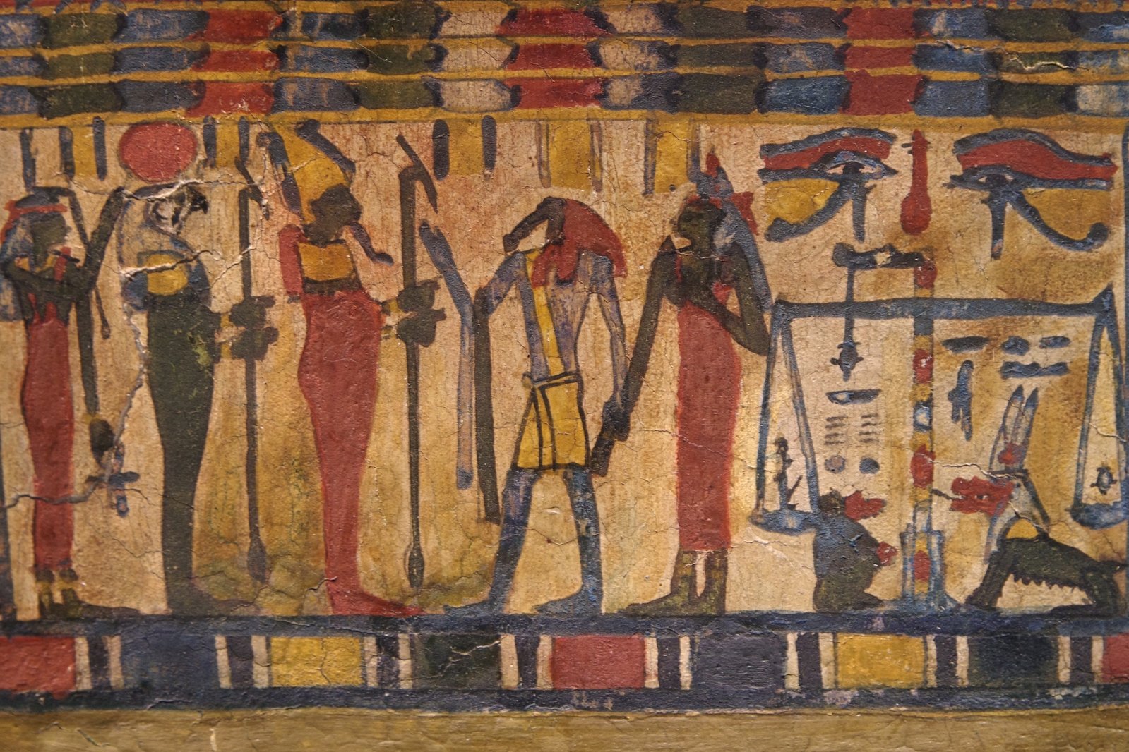
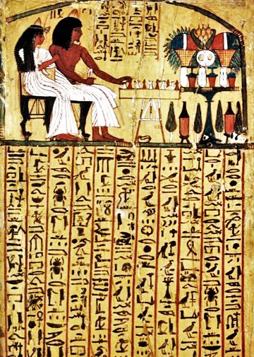
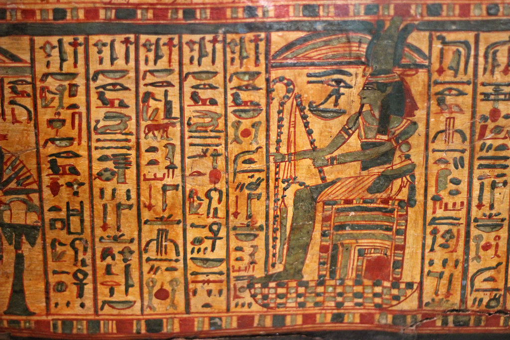
Egyptian Hieroglyphs
Ancient Egyptian images were intimately intertwined with their written language in the form of hieroglyphs. In a way, we can see the visual tree of words and images begin to split into two distinct branches as history progresses. This early method of communication is sort of the primordial ooze of both pictorial art and literature. Egyptian images were symbols and their symbols were images, and lines were used in both for clarity.

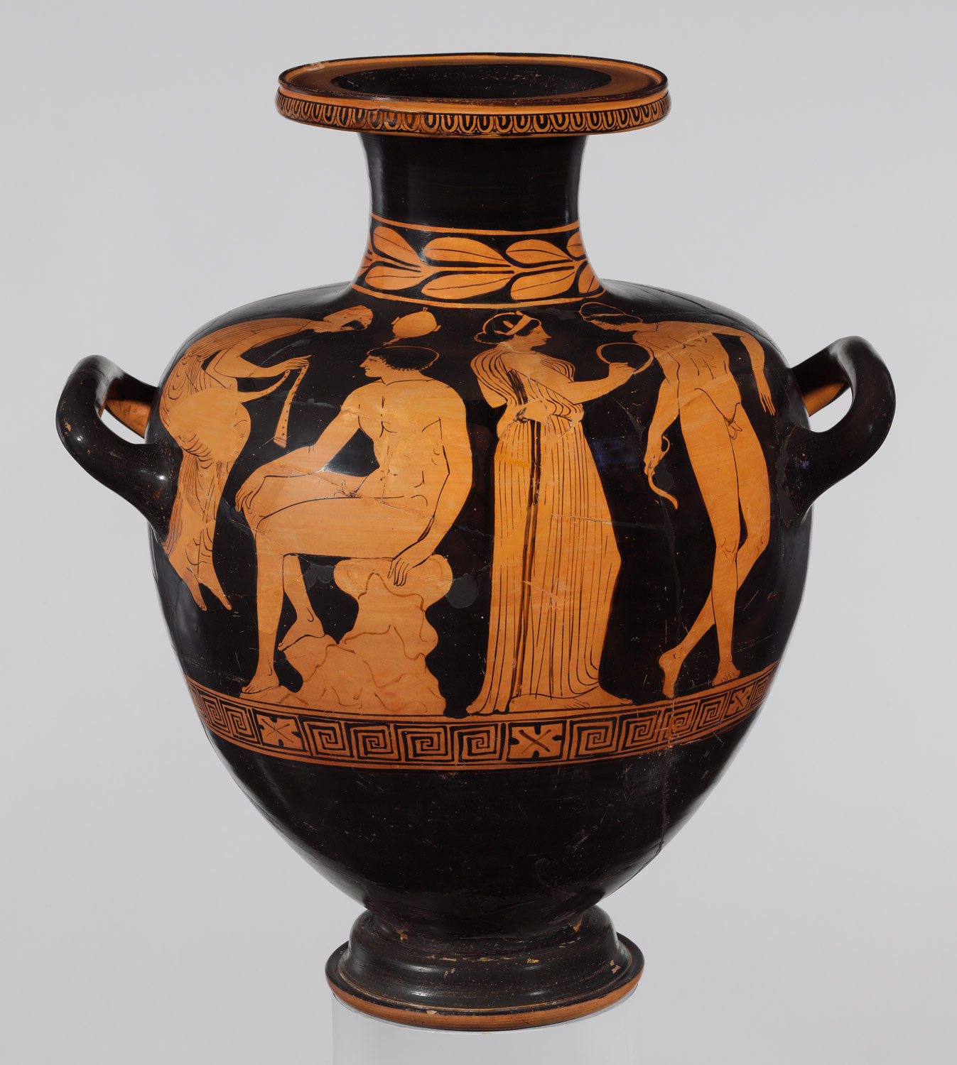
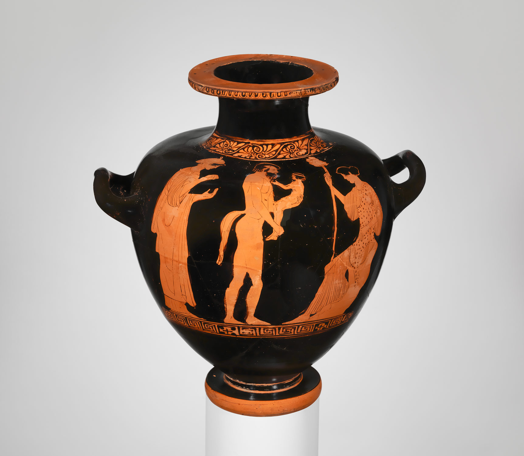
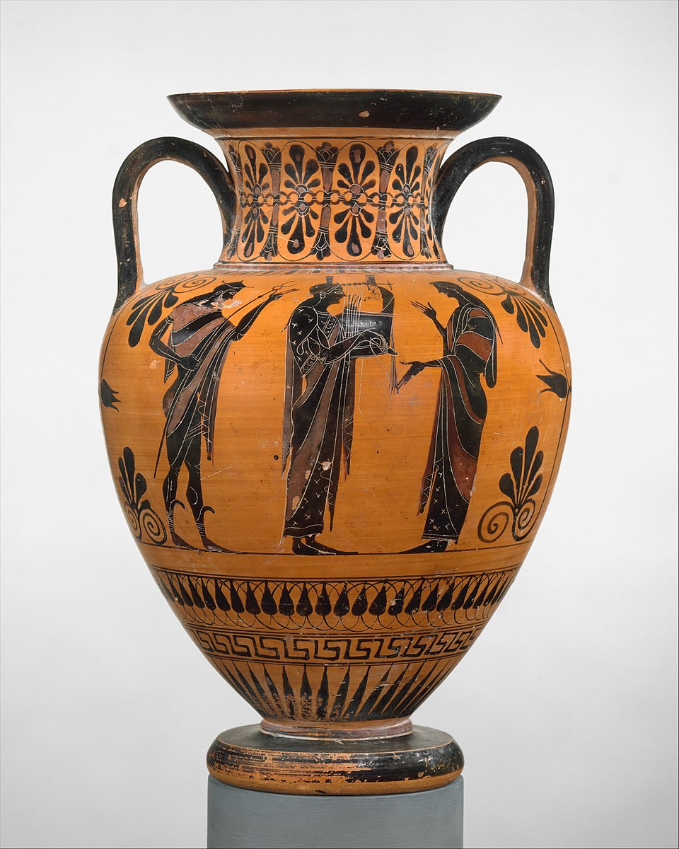
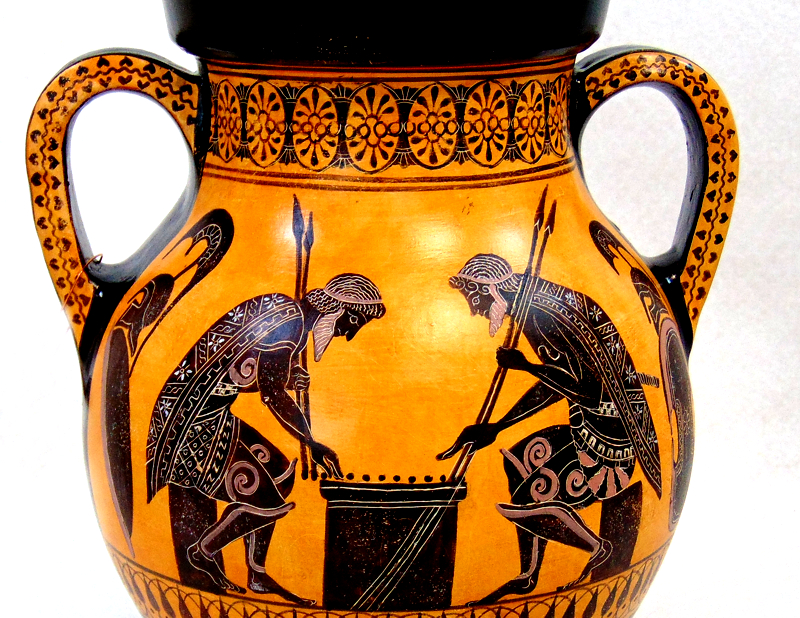
Greek Vase Painting
Shifting forward a few thousand years, it’s worth taking a look at the Greek vase painting. Here the approach to figure representation is similar to the style of early Egyptian hieroglyphs but the skills of application have evolved. Narrative images wrap around the pottery intertwined with decorative symbols. The attention to detail and the elegance of the rendered forms are much more nuanced and life-like than the stiffness found in hieroglyphs. Greek vases are broken into two eras, red-figure, and black-figure. The red figures are outlined in black paint and thine black lines are used to detail the figures themselves. Black figures have their interiors painted in black and the lines are removed to reveal the color of the pot. Both styles are incredibly stylized and very graphical in nature and create a distinctly recognizable image.
Turn of the Century Simple-Line Contour
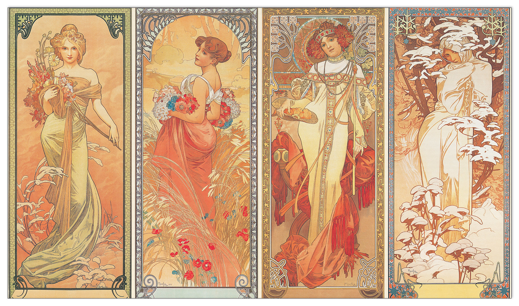
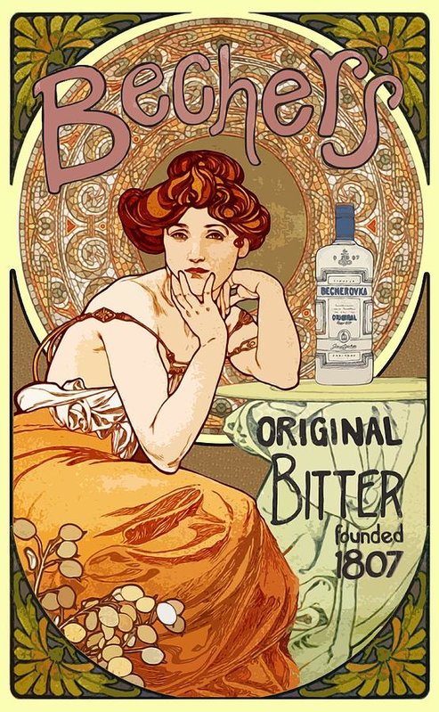
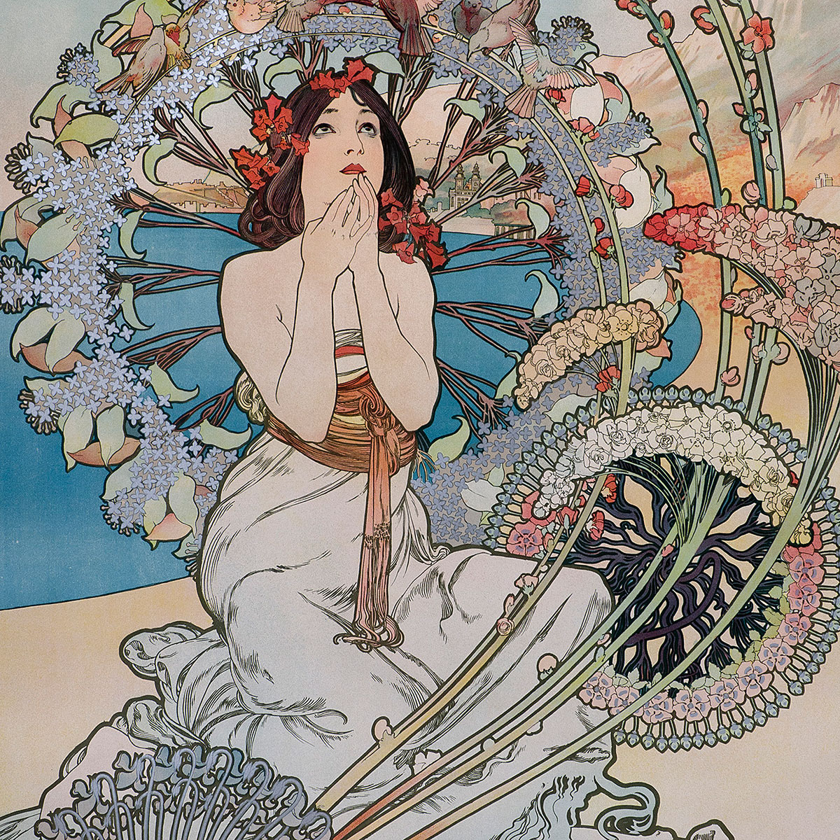
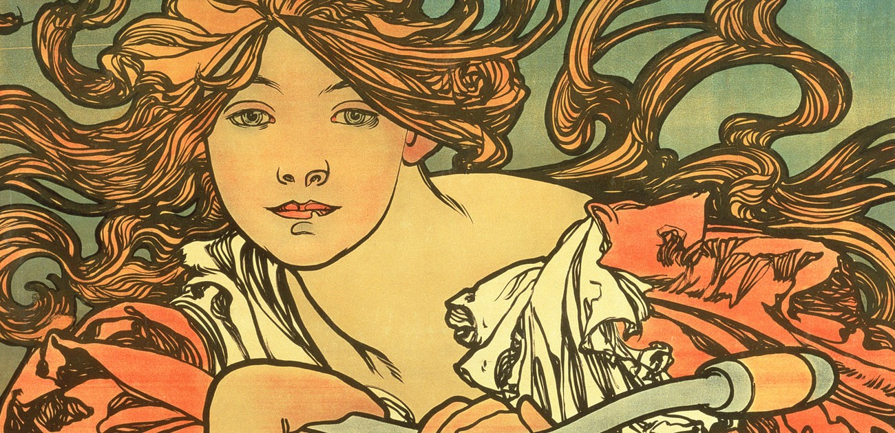
ALPHONSE MUCHA
Mucha, to me, is the purest example of a blending of the two approaches. As a painter, illustrator and graphic designer during the Art Nouveau era his knowledgeable range of skills contributed to his original style. Here we can clearly see the simple-line contour techniques of old but in conjunction with the masterful planning and composition techniques that grew out of the Renaissance. His avoidance tonal rendering contributes to the delicate feminine appearance of his work. Tonal variation and gradients are used minimally and as a device to create a focal point for the eye. The art salons of his time were dedicated to the traditional craft forged during the Renaissance. Mucha's departure into minimalism was part of a movement of the era and opened the door for other artists to explore simple-line contour as well.
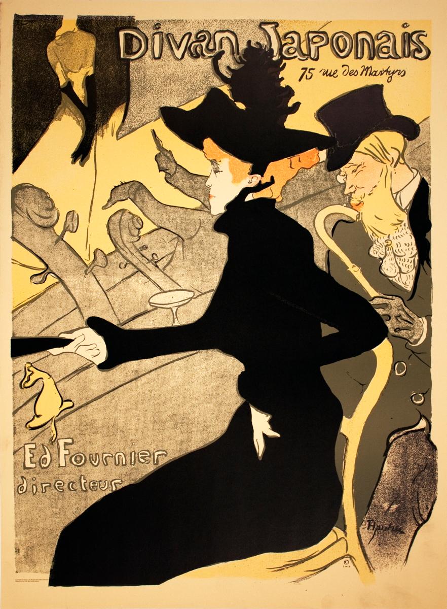
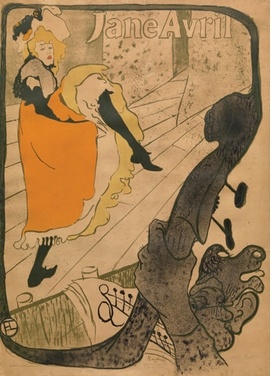
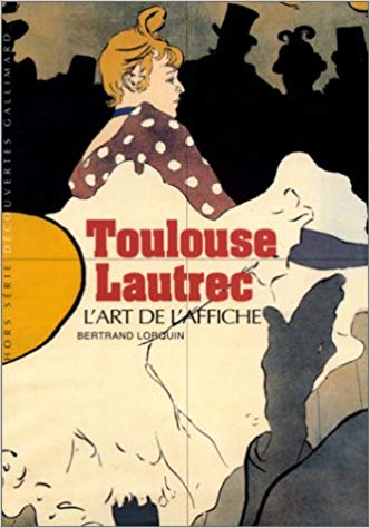
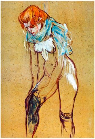
Henri Toulouse Lautrec
Toulouse Lautrec was another well-rounded artist working as a painter, illustrator, print-maker as well as a caricaturist. It’s my belief that Toulouse Lautrec’s unorthodox style emerged from his involvement in caricature. Caricature has its roots firmly planted in the comics realm and thus has a history of utilizing simple-line contour. This merging of worlds led to Lautrec's innovative voice.
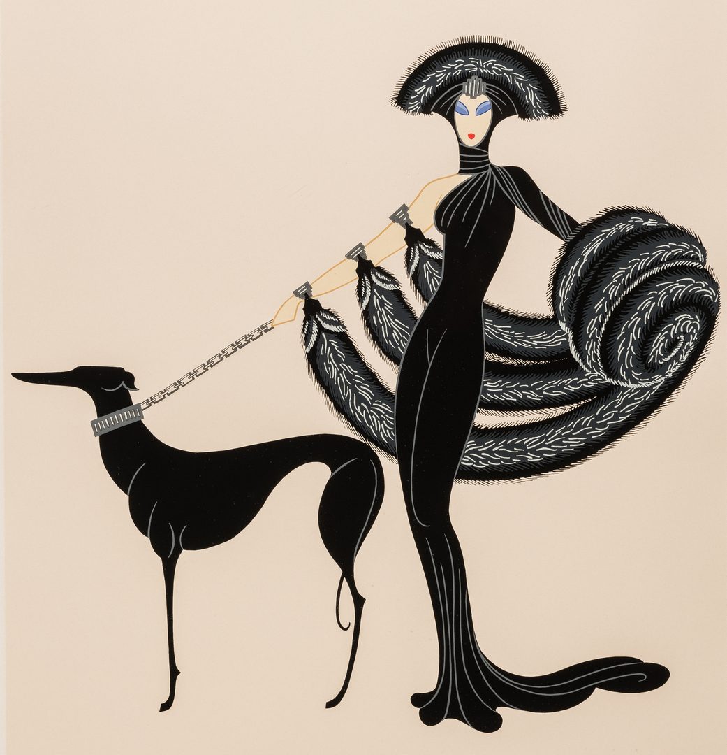
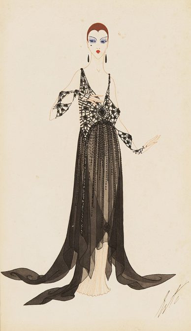
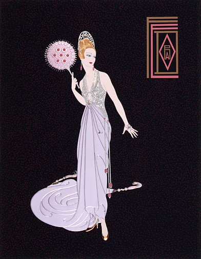
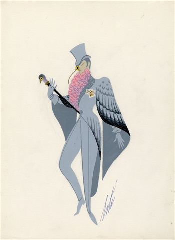
Erte
Simple-line contour was an essential element of the two emerging art styles of the early 20th Century: Art Nouveau and Art Deco. Previously we discussed Mucha, essentially the face of the Art Nouveau movement. The equivalent artist in Art Deco would be Erté. Branching out from illustration, Erté became a recognized fashion designer for the theater as well as film. His simple-line illustrative style became the look associated with Art Deco figures.
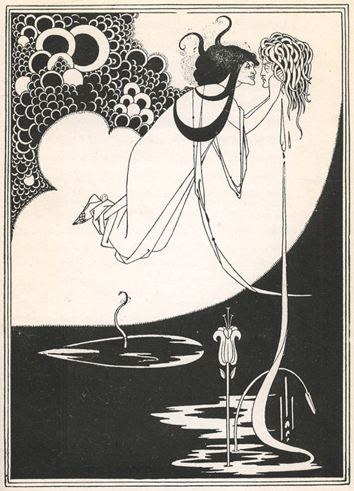
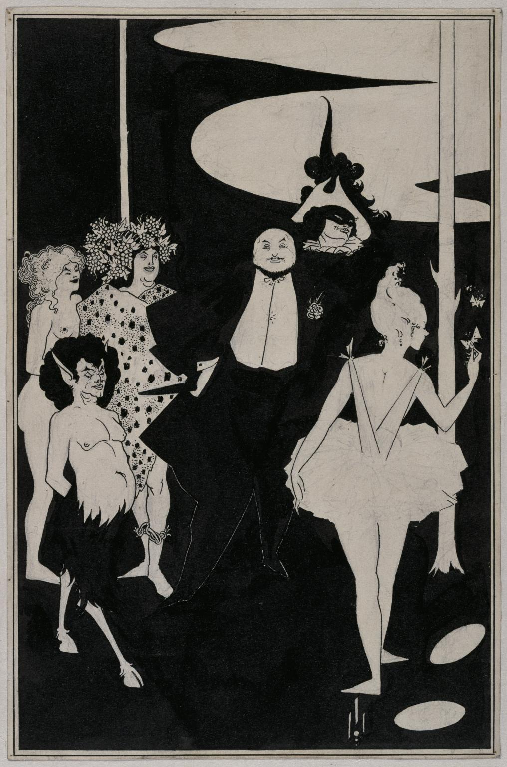
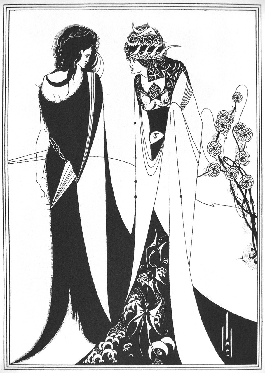
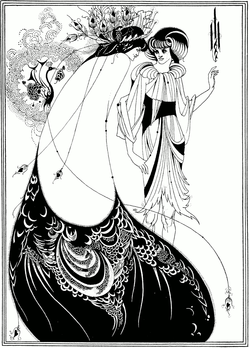
AUBREY BEARDSLEY
Beardsley, inspired by Japanese woodcuts as well, as the waters of Art Nouveau and Art Deco, developed his own black and white style using simple-line contour. His work acts as a nice transition from the examination of the painting/academic world towards artists within the comic art world; this is partly due to his exclusive use of black and white and partly due to his methodology. Beardsley was definitely well versed in the fine art world of his time but chose to swim in murkier waters and make his own vision. He preferred to focus on the grotesque and perverse without worry of being shunned by the art world. This freedom allowed him to make art through a more exploitative and unique lens.
Comic Book Simple-Line Contour
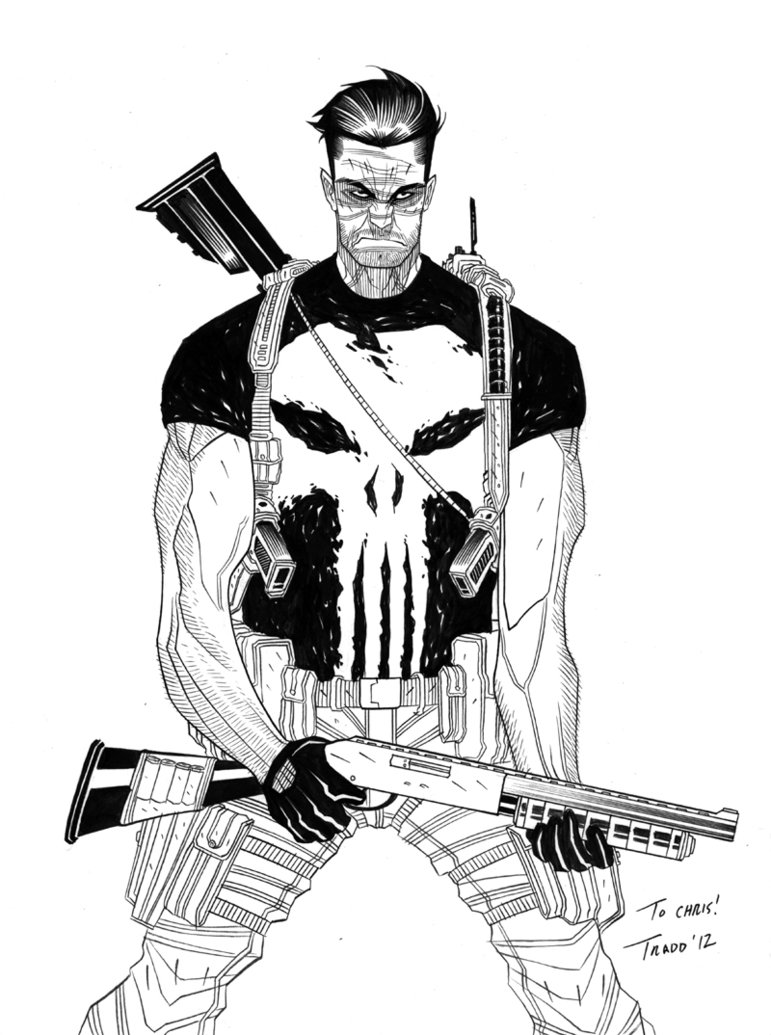
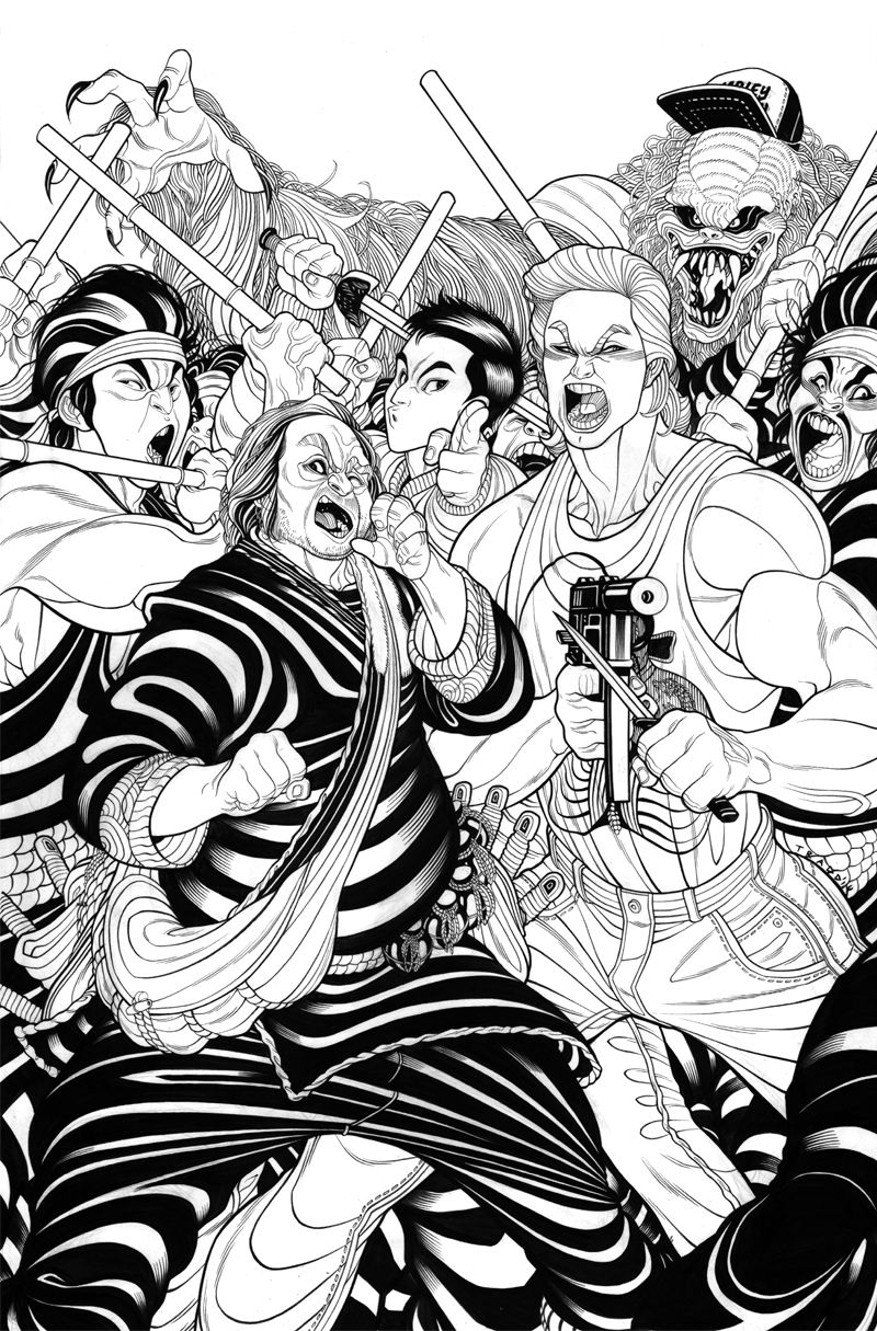
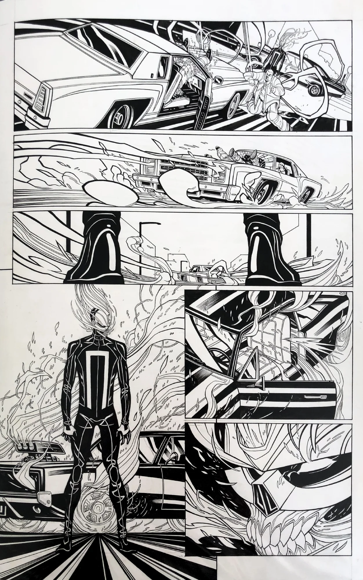
TRADD MOORE
Tradd Moore has a distinct style within the comic industry, sporting clean and elegantly flowing lines that carry their own life-force. The power of simple line contour lies within not just the flow of the line, but a strong understanding of balancing positive and negative space. It is through the simplicity of line that the focus is on the shapes and how they move and sing on the page. Tradd’s work has roots in the wonderful history of simple-line contour, but he molds his style and shapes to the format of the comic book medium. His original pages are a work of art unto themselves, but the experience a reader receives reading one of his graphic novels is a living work of art. For this reason, I suggest heading over and picking up his latest book, The New World, hot off the press at your local comic shop (or if you must, on Amazon).
Thus concludes this little exploration of Simple-Line Contour. Ultimately, most comic artists use a variety of techniques including variations of line-use within them. I wanted to explore the idea of finding the essence of a style by tracing it to its roots and following where it has led. Since I’m not studying for a PhD in comics, I have only touched on the surface using my prior art historical knowledge. However, there are many interesting links within the world of comic book art that have ties to various art lineages. This is something I plan on exploring more in future posts. For now, hope you’ve enjoyed the read and until next time, keep making comics!